4 min read
The general criteria for a new website design for businesses is for it to look good, attract customers and, ultimately, convert. However, one thing that isn’t considered as much as it should be is accessibility.
There are more users that rely on digital accessibility than you think, so it is imperative that you implement the correct measures to meet their needs. Do you want to attract every single customer possible? Then, you need to have an accessible website.
Digital Accessibility & Website Design
What Does Digital Accessibility Mean?
For clarity, digital accessibility refers to building digital content that is accessible to everyone. This means that every user will be able to have access to the same information regardless of visual, auditory, cognitive or motor impairments.
Why Should You Design for Accessibility?
There are a huge number of reasons why you should design a website with accessibility in mind, plus benefits.
Expand Your Potential Audience
Of course, the main reason to design a website for accessibility is the fact that everyone will be able to visit and experience your business’ website. You don’t want to exclude anyone as a customer, and you don’t want any audiences feeling ignored. From a business perspective, the more users that can access your site, the more potential customers you will gain.
Improve Usability for Everyone
When you design a website, user experience is always at the forefront. By designing a website with accessibility at the forefront too, you can actually improve the overall look, feel and usability too. By thinking about how accessible your website is right from conception, you can future-proof your online presence and employ more flexibility.
Meet Accessibility Standards
If you are looking to grow your website on a global scale and reach an audience across the world, you need to make sure that your website is accessible. Some countries have legal requirements for websites and software to be accessible and comply with specific accessibility standards.
How to Achieve Accessible Design
Contrasting Colour is Key
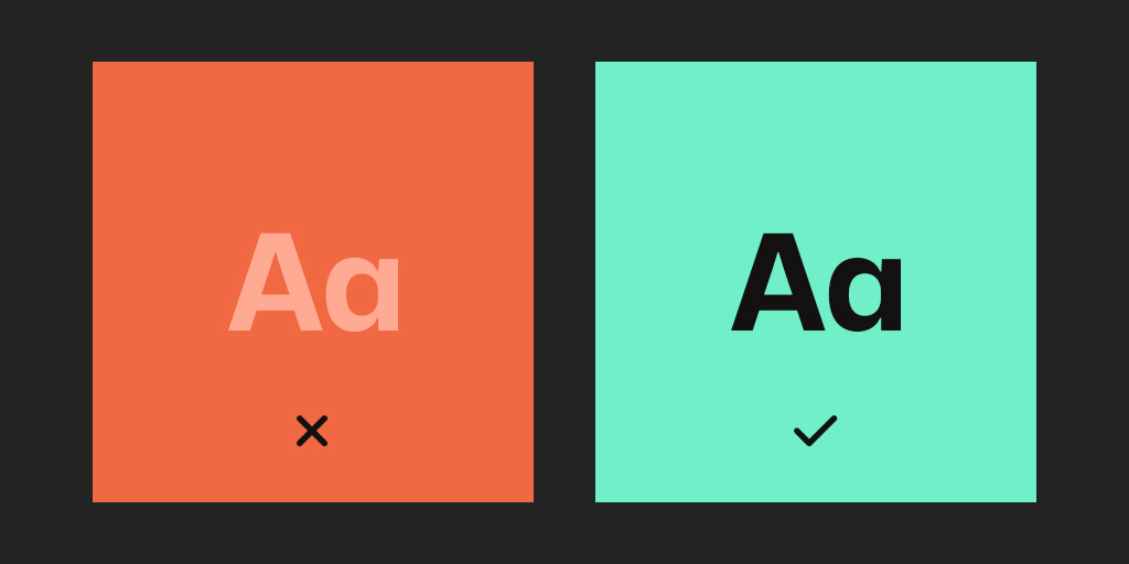
The colour scheme you choose for your website is one of the most important aspects of accessible design. For visual impairments, the contrast between text and backgrounds is crucial; if it is too low, it can be incredibly difficult to read. You need to make sure you choose a dark colour against a light, with no bleeding, for the best results. Everyone should be able to distinguish between various elements on the page with sufficient contrast. In order to guarantee the best colour contrast, you can use the WebAIM Colour Contrast Checker before making any final decisions.
Visual Elements for Critical Information
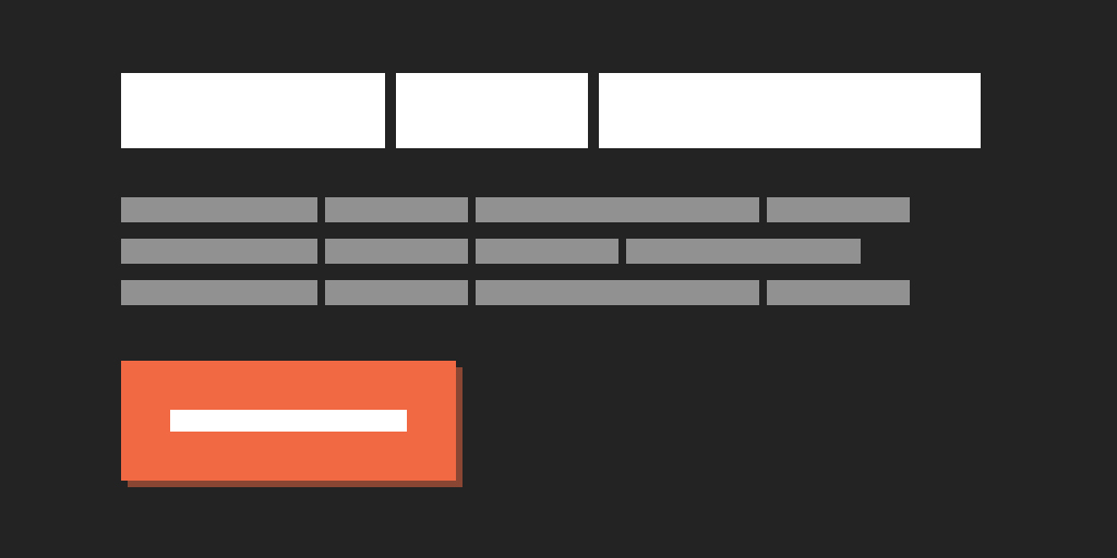
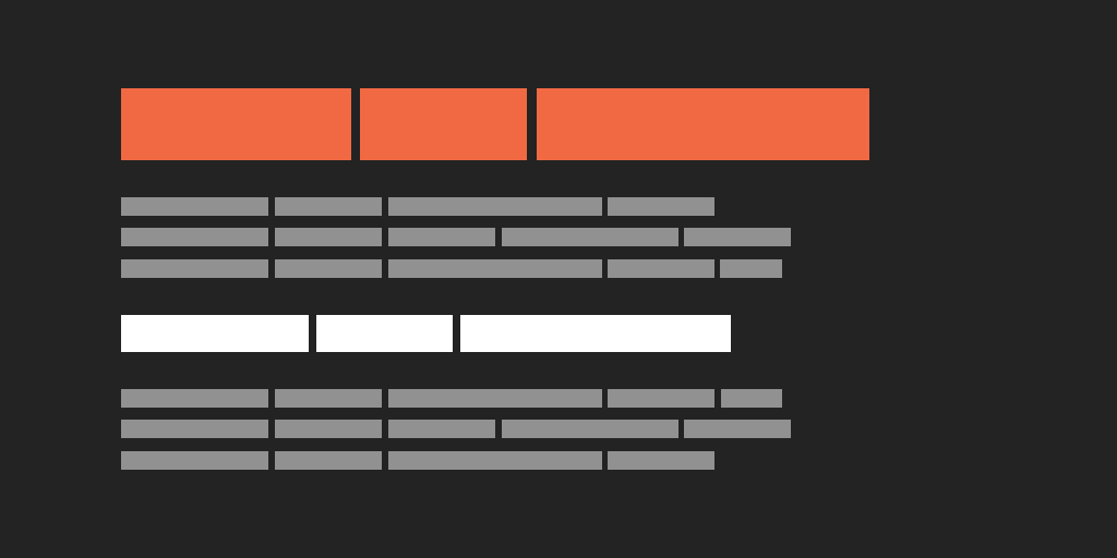
Whether it’s an important message, indicating an action or encouraging a response, you need to be aware of accessibility. Instead of using just colour to communicate these, make sure to use icons, text labels or patterns too. Other visual elements like a stand-out title and varied text weight can help people with low visual acuity or colour blindness understand your content.
Use Headings for Accessible Content
Heading tags are essential for accessibility, communicating the hierarchy of the content, but they can also be stylish too. Screen readers use heading tags to read content, so it is vital that your headings aren’t just big, bold fonts, they are proper HTML elements. Of course, you can still design your different headings to be striking and on-brand though!
Don’t Forget Focus Indicators
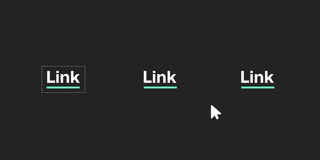
The default focus indicators that browsers use may not look great but don’t hide them, replace them with something else. For individuals who use the keyboard as their primary way of navigating the internet, it’s important to keep focus states on your website. Get creative and design focus indicators for your links, buttons, menu items, etc. that match your style perfectly. Remember high contrast too!
Address Keyboard & Menu Navigation
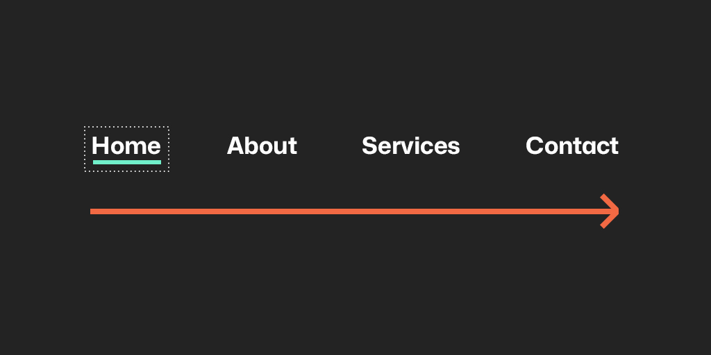
As mentioned above, when it comes to designing your website, it is important to consider users who rely on their keyboard for navigation. This means you need to make sure that all of the interactive elements on your site are ordered in an intuitive way. From left to right, top to bottom, they should follow the visual flow of the page; test your site using just your keyboard to see for yourself. Also, remember when you’re deciding on your sitemap and navigation during the planning stage, keep it as concise as possible.
Make Contact Forms Accessible
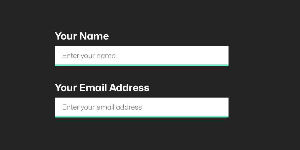
Although it looks simple and chic, placeholder text within fields of a contact form does not provide accessibility. Not only is it usually grey, but these labels also commonly disappear once you start typing. For people who use screen readers, this text will be missed and therefore cause confusion. You never want your user to feel confused or lost so always remember to label each field clearly, preferably adjacent to the particular field.
Website Design for Accessibility by Logic Design
Great website design is finding the perfect balance between the beautiful and the accessible. It is not difficult to achieve and, by addressing these two factors during the conception of your web presence, you will ultimately be creating a design that is completely user-friendly and future-proof.
Would you like to work with a professional team that will ensure your website is designed with accessibility in mind? Contact us today by calling 01473 934050, email us at hello@logicdesign.co.uk, or leave us a message on our contact page.