5 min read
What is Visual Hierarchy?
Visual hierarchy in website design is not something you are consciously aware of but, once explained, you will know exactly what it is. For a website designer, it is something they always have in mind as there are various elements which need to be understood and followed.
The definition of “hierarchy” is an arrangement of items that are represented as being above, below or at the same level as one another. Therefore, visual hierarchy refers to the arrangement of design elements on a web page.
The thought process behind determining the website hierarchy is deciding the order you want your users to view the elements and how it is digested. Where do you want them to look first? What is more important and therefore should be placed at the top?
The decision is up to you, not the website visitor. Their eyes will follow each element in the order they’re meant to view it because of the visual hierarchy you have chosen to implement into the design.
Why is Visual Hierarchy Important in Web Design?
By influencing the order in which your visitors view your website content, you can guarantee a clear journey towards your conversion goal. By defining which elements are more important, you will create the impact and value how you want, where you want.
Without visual hierarchy, everything on the page will be of equal importance. There is no guidance for the visitor, no website information hierarchy, so they get completely lost on the page. With no place to start and no direction, they will miss your point entirely and leave.
What Can Be Used to Improve Visual Hierarchy?
There are 12 visual hierarchy principles that should be followed in order to achieve the website hierarchy and user journey you desire.
1. Use Size to Attract User Attention
The bigger the element is, the more attention it will draw. Therefore, the most important aspect you would like to emphasise on the page, the website information top of the hierarchy, should be the biggest.
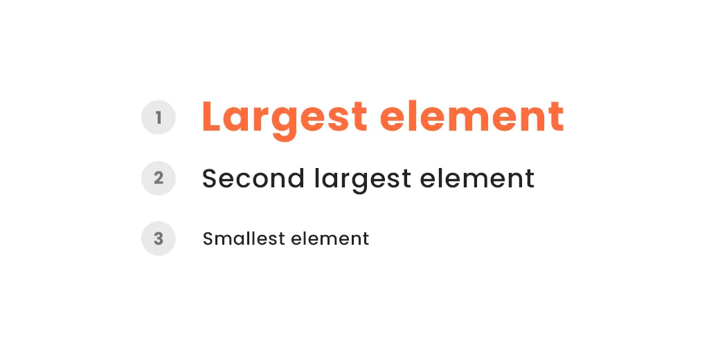
However, there is also the argument of balance; you need to make sure that the sizing doesn’t overshadow other components so they are inadequate. With no scale until one element is compared to another, designers are able to create balance as they go.
2. Play with Perspective & Power
As a 2D interface, another way you can emphasise your visual hierarchy is by playing with perspective. Creating an illusion of distance between your elements brings focus to areas that are at the top of the website hierarchy. Following on from the point above, larger objects are seen as being closer than smaller objects, consequently drawing more attention and power on the page.
3. Balance Contrast & Colour Schemes
Brighter colours will draw attention more than muted ones. Colours with a higher contrast will also grab a visitor’s focus more than ones with a lower contrast.
Effective colour combinations can create the desired visual hierarchy you’d like on your website but it’s important (again) to get the right balance. Creating contrast and emphasis on the most important elements is all well and good, however, using too many contrasting colours will confuse the visitor.
4. Use Your Fonts to Your Advantage
Every font can be customised to create the impact you want on your website. If all the content was in the same sized font and weight, there would be no focus on the page. By increasing the size of the font, you will draw the visitor’s focus to this text.
Heading text is traditionally larger and heavier than paragraph text, so you can use this to guide the visitor through your visual hierarchy in design and focus on the areas you want to have the most impact. It also organises the page for easier navigation and to help them find the sections they’re interested in.
5. Follow the Z or F Pattern
Even though each individual has their own viewing pattern which then, in turn, might change for the type of content they’re viewing, there are 2 main viewing patterns to follow in website design. The Z pattern is normally used for sites that aren’t text-heavy and guides the visitor from top-left to top-right, then down to the lower left, and across to the lower right – like a Z.
The F pattern is normally used for text-heavy sites like blogs or news and guides the visitor from the top left to the top right, then down to the next line from left to right, and so on – like an F. Having these letters in mind when designing your website will help organise your hierarchy in design.
6. Group Related Elements Together
It’s a natural instinct to assume elements that are grouped together to be related. This consequently delivers a further message to the visitor, so you can use this principle to draw their focus to certain elements on the page. It will also give them incentive to either read on or engage further with your site.
7. Utilise Negative Space, Don’t Forget It
The negative space is just as important as the space you fill your design with. When you think about grouping elements together, as mentioned above, the negative space in between each element determines the importance of each one. If you want to draw the visitor’s eye to individual elements, separating them with negative space will pull their focus. As well as this, it also makes information easier to digest.
8. Choose Your Alignment Wisely
Following on from the viewing patterns and thinking about how visitors follow the page, the alignment influences this too. Typically, a page of text is left-aligned as Western readers are accustomed to reading from left to right. However, central alignment represents balance and harmony, especially in simpler designs. Alignment to the right can provide balance to the page that is particularly left-heavy. All in all, the alignment should be chosen to enhance your design and website hierarchy rather than hinder it.
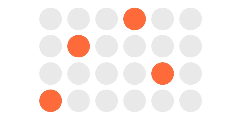
9. Follow the Rule of Odds
A group of an even number of objects is less impactful than a group of an odd number of objects. Why? Because with odd numbers, there will always be an object that is in the centre therefore creating a direct focus.
Another example of the importance of balance in the visual hierarchy of a website, the rule of odds results in an aesthetically pleasing design which is easy to follow and understand. Elements that are offset can also create an imbalance but only when they are sparsely included, otherwise the design will be chaos.
10. Repetition, Repetition, Repetition
Consistency is key throughout a design to ensure an intuitive flow for the visitor. They will become familiar with the style and feel more at ease looking through your website. One way you can highlight important elements in your website hierarchy is by repeating a component. This enables it to stand out on the page. This could be a line, colour, or shape that surrounds the element that has the most importance.
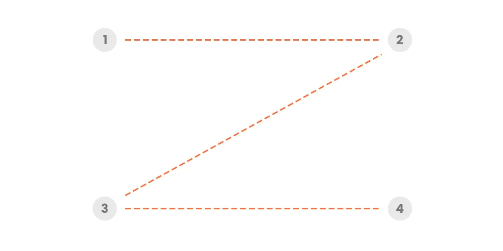
11. Use Motion Throughout Your Design
Incorporate movement and motion in your design by using lines to lead the visitor’s eye to the elements high up on the visual hierarchy. Other components such as dots can be used to create the motion and a focus around a specific element on the page. These components can be shaped into arrows or lines that are showing ascension or descension to imitate movement and engage visitors.
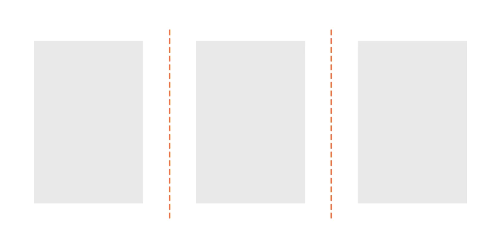
12. Organise Your Design Using a Grid
By using a grid to determine the layout of your design, the overall balance of composition is achieved. The rule of thirds is a common technique to follow, building a grid using 2 horizontal and 2 vertical lines. Instead of placing components in the middle of the grid spaces, off-centre compositions are preferred due to the use of negative space and effective alignment – principles mentioned above. You can do so by highlighting the 4 points where the lines meet instead.
What is Visual Hierarchy in Web Design?
We understand this is quite a lot of information to consider when designing a website. Luckily, our team of expert website designers can take care of your visual hierarchy. By taking the time to delve deep into your project and business, identifying what’s important to you and finding out all the essential information, they can design the perfectly balanced design for you.
Need some creative direction and inspiration? Take a look through our case studies or contact us today by calling 01473 934050, emailing hello@logicdesign.co.uk, or leaving us a message on our contact page.